Color. As we quilters, toying with color in all its various combinations is a significant part of the joy in the art. I was blown away by the way color was used in Taos. It wasn't that there were any new colors; it was it the way the colors were put together ~ the rusty tones, near reds, and gold paired with turquoise, teal, royal blue and occasionally purple. This wall of pottery suns shows exactly what I'm talking about:
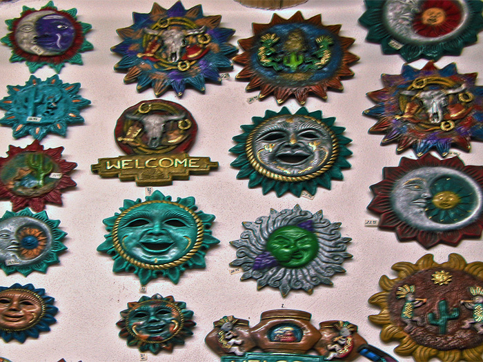
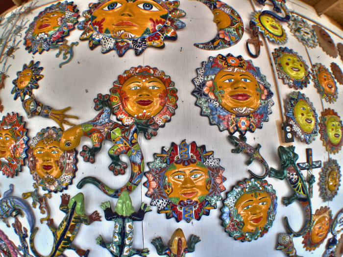
The photo above contains the more muted tones, but this one shows the same color combinations in vivid brights:
I came home inspired. Now if I can just find a time to put vision to fabric....
(My thanks to Eric for again allowing me the use of his pictures.)
The photo above contains the more muted tones, but this one shows the same color combinations in vivid brights:
I came home inspired. Now if I can just find a time to put vision to fabric....
(My thanks to Eric for again allowing me the use of his pictures.)
So pretty! I love the turquoises.....
ReplyDeleteOoh, nice! I'm really liking the brights! :)
ReplyDeleteOOoh I like both colour combinations.
ReplyDeletethat first photo reminds me of your NY beauty quilt.
ReplyDeleteI love those funny pottery suns! Those colors are amazing and however you put them together in a quilt will be gorgeous!
ReplyDeletexo -E
EFFING STUNNING!
ReplyDeleteLove those colors!
ReplyDelete